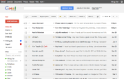
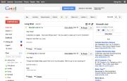
Google is introducing a revamped interface to its Gmail webmail service, similar to the much-praised look and feel of the Google+ social network. The new interface is part of a Google-wide effort to unify the user experience across its services and is slowly rolling out to users now.
To access the new Gmail themes, look for the Themes tab in Gmail Account Settings, and you'll see the "Preview" and "Preview (Dense)" themes. Google User Experience Designer Jason Cornwell explains the two themes are implemented as "our new interface will eventually expand dynamically to accommodate different screen sizes and user preferences, but until then you can pick the information density that you prefer. "
The new Gmail themes are fresh and uncluttered, and have a Google+ look and feel (if you are lucky enough to get an invite). Some Labs features though may look a little strange in the new themes, as not all of them have been optimized for the redesign (Google promises to work out the kinks "in the coming months").
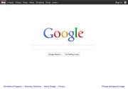
Gmail is not the only service to get the refresh, either. Google Calendar, Maps and even the classic homepage got a similar makeover.
If you can't see the new Google designs in some of the services you use, be patient. "The changes are not going to happen all at once," Cornwell adds. "We'll be working on these upgrades gradually over the next few months to allow plenty of time to understand and incorporate your feedback into the evolving design."
Are the Gmail and Google Calendar redesigns live for you? Are they enough to convince you to use the Web version over an e-mail client? Sound off in the comments.


0 komentar:
Posting Komentar